MetaRefresh

2014

From website to event branding, I covered the complete design work required for MetaRefresh 2014 conference. The theme of the conference was intersection between design and code, which indeed aligned with my core skills and perspective, hence I thoroughly enjoyed the complete process. This website got featured by designmodo as a properly structured conference website.
Logo was given which had orange & black colors. The conference is about web UI, with 2014 edition theme being frontend code & design intersection.
Designed in 2014
For HasGeek
  • Color palette
  • Website design & Development
  • Stage design
  • T-shirt design
  • Badge design
  • Banners design
Website
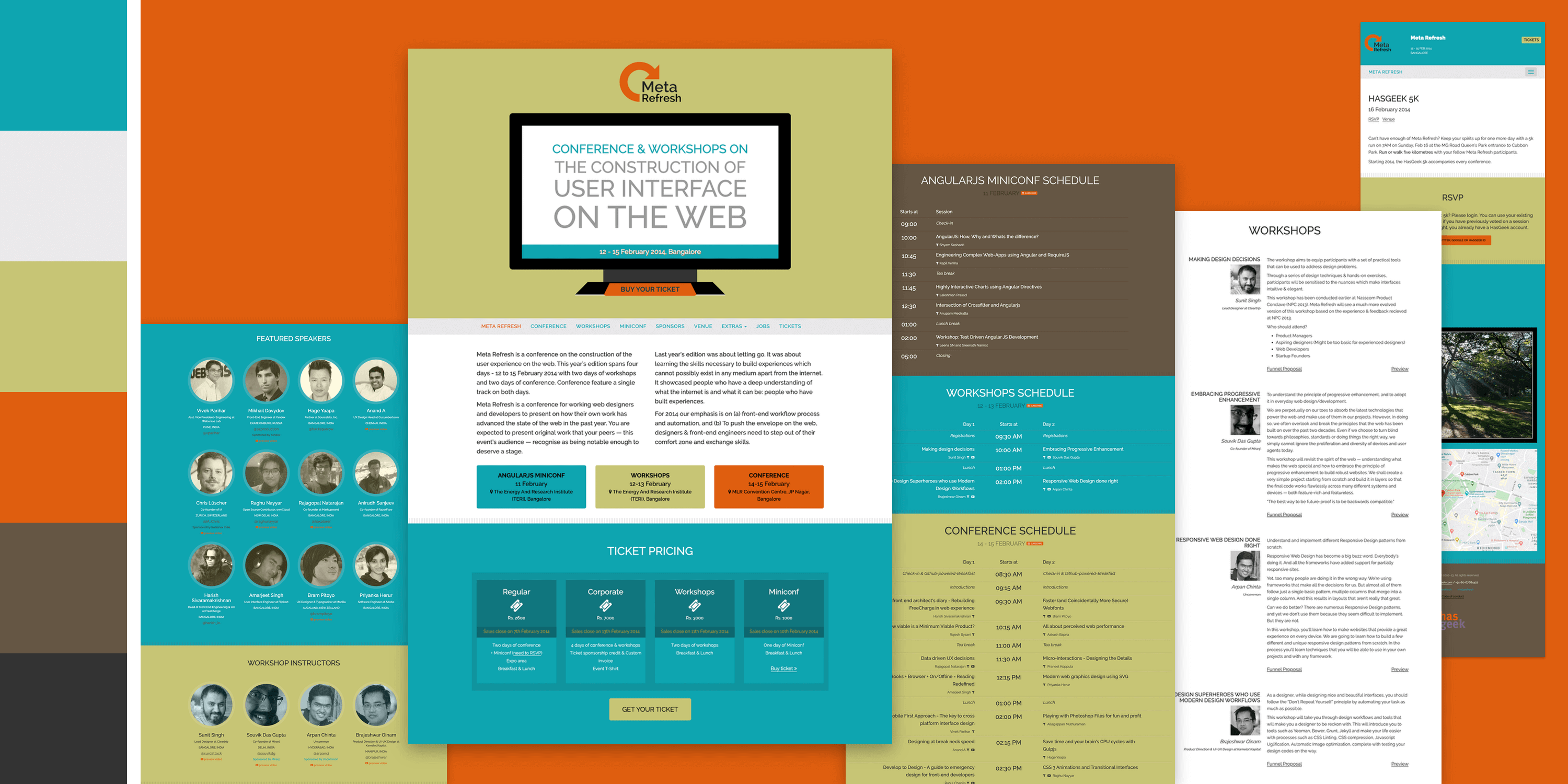
Color palette & website Design
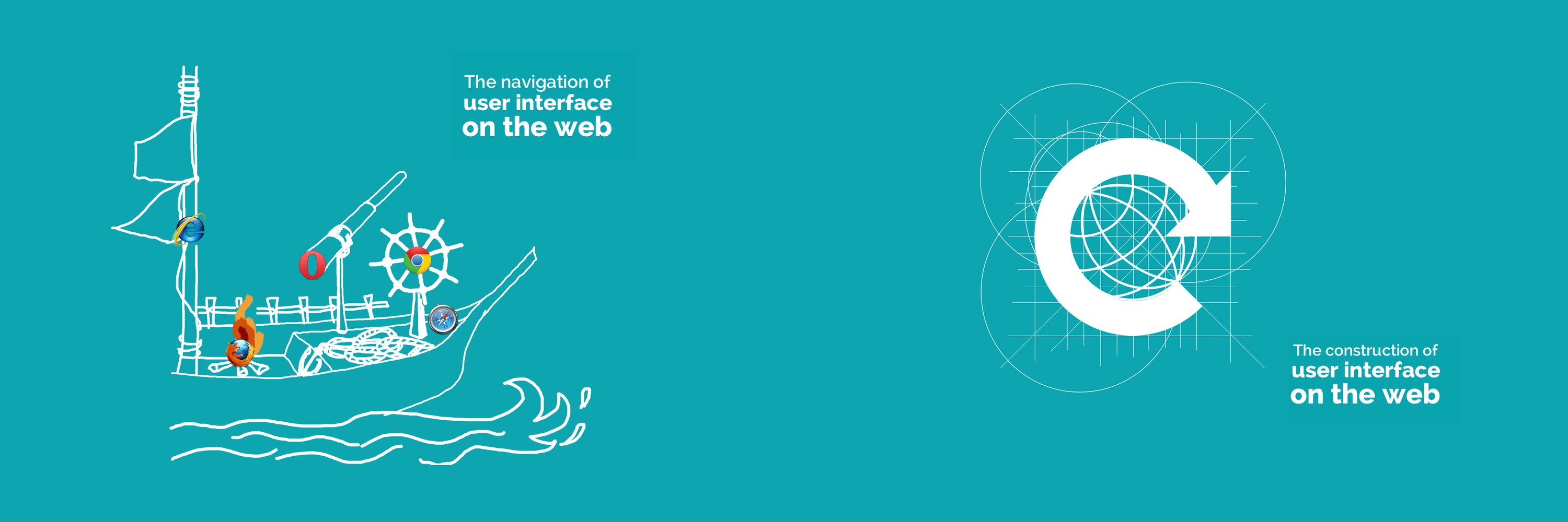
Masthead concepts
Playing around with website masthead concepts!

Stage Design

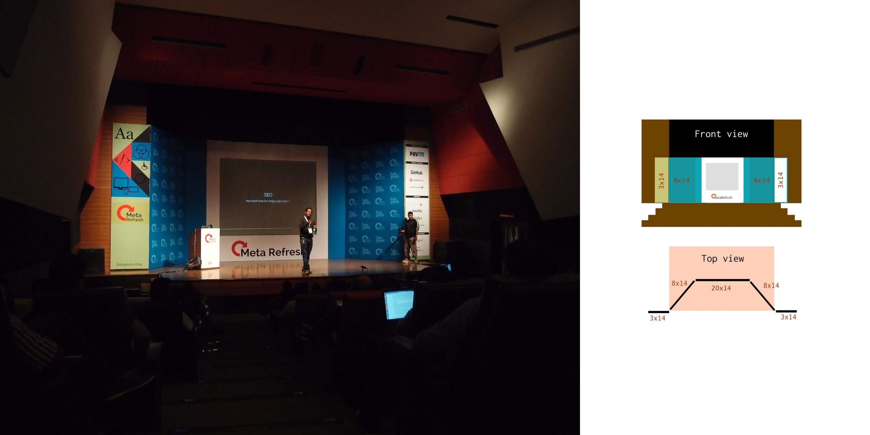
Proposed a 5-panel layout replacing the usual single flat panel backdrop. This covers the complete stage horizontally without leaving gaps. Center piece includes projector screen with frame-like border, left piece with conference branding, right piece with sponser logos and the rest of the area is with neutral color faded logos pattern - this is for a clean background in recorded videos.
Stage
Stage Design

Tshirt Design

A minimal text showing fused code + design in Raleway font. I felt this would be the best way to show code & design intersection. There was another candidate which had horizontal to vertical transition with reload icon indicating the direction change, but the chosen one is more lightweight.
T shirt

Badge Design

Implemented the idea of having schedule printed in the attendee badge rather than handing over printed schedule separately.
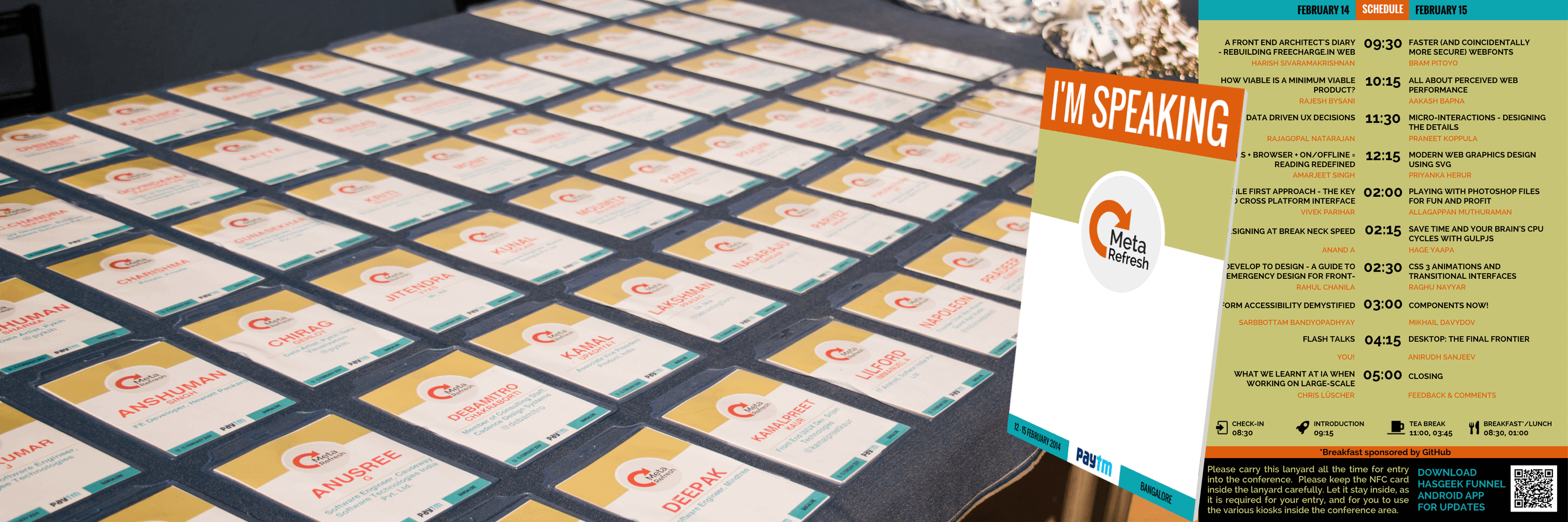
Badge
Badge Design

Banners Design

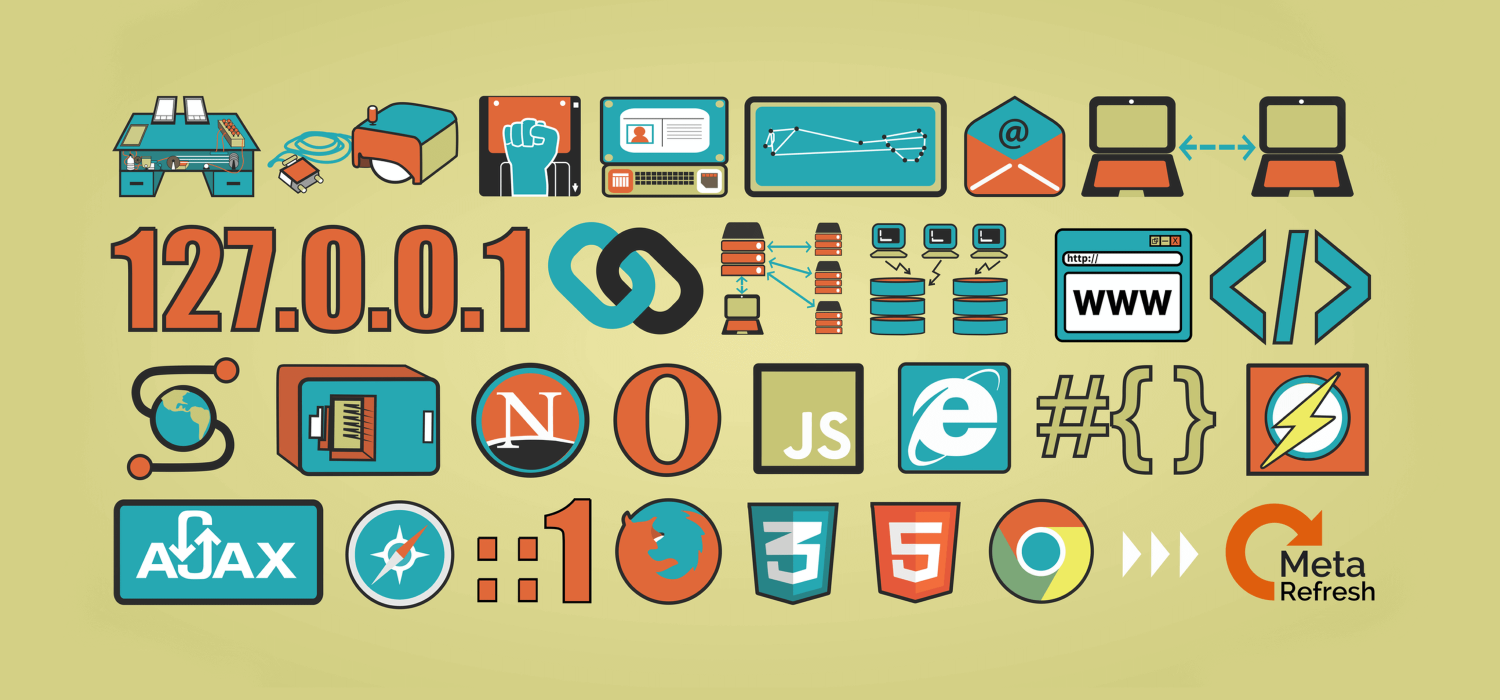
Created a banner showing major web history milestones followed by MetaRefresh logo depicting it to be yet another major milestone in web history timeline 😝. I intended to make hand-drawn style icons here, but since I don't have a graphic tablet, just used basic shape tools in the editor. This was placed at the main entrance. The standee at the Auditorium entrance had jumbled characters of "metarefresh2014" in various fancy fonts.
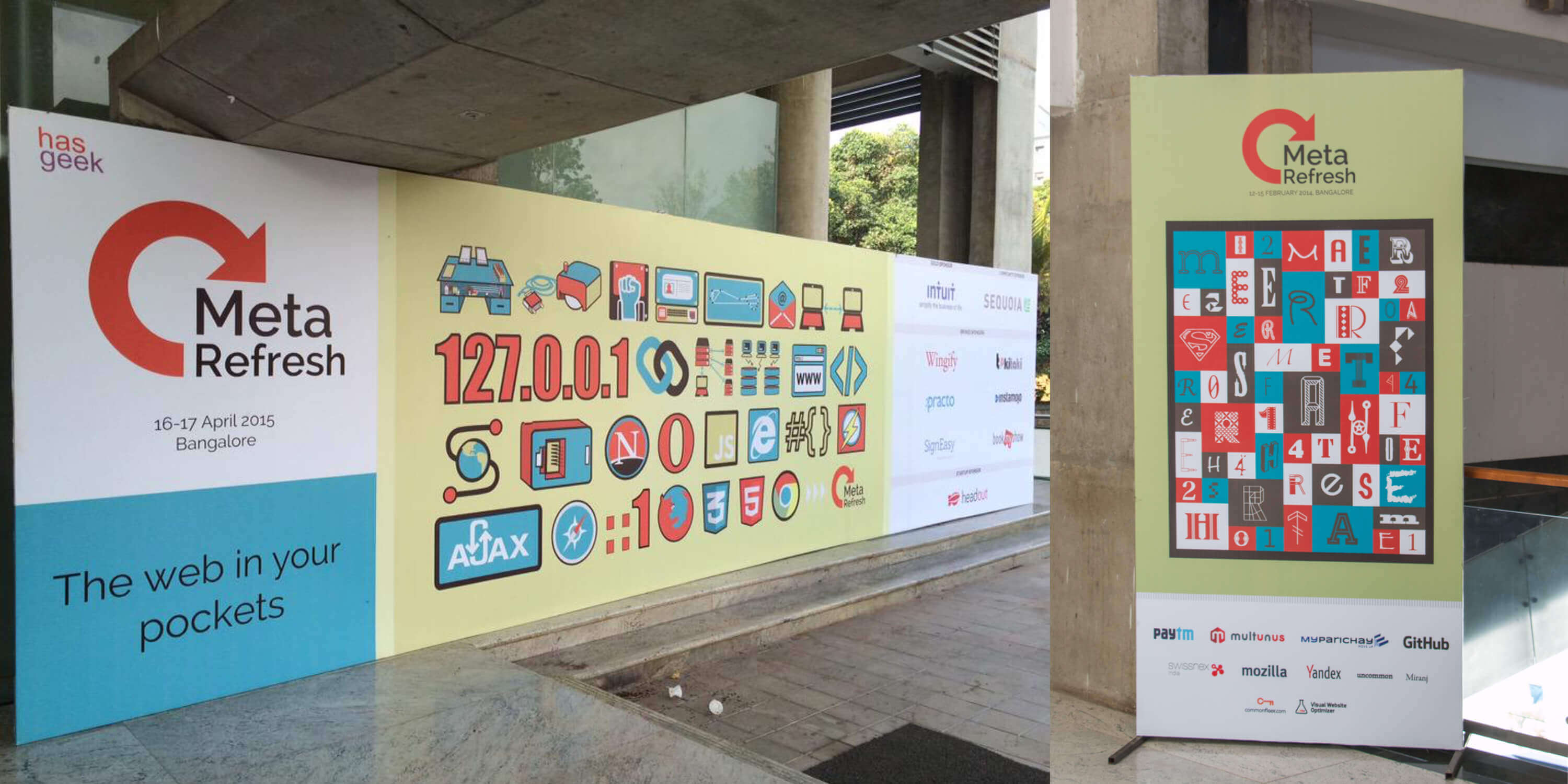
Banners
Banners at venue entrance & auditorium entry
Web history
Web history concept: 1. memex (1945), 2. mouse (1968), 3. hypertext (1965), 4. NLS (1968), 5. ARPANET (1969), 6. email (1971), 7. Wireless LAN (1971), 8. IPv4 (1981), 9. Hypertext link (1983), 10. DNS (1983), 11. SQL (1981), 12. WWW (1991), 13. HTML (1993), 14. Mosaic (1993), 15. dial-up connection (1992), 16. Netscape Navigator (1994), 17. Opera (1995), 18. Javascript (1995), 19. Internet Explorer (1995), 20. CSS (1996), 21. FFlash (1996), 22. Ajax (1999), 23. Safari (2003), 24. Firefox (2002), 25. CSS3 (2011), 26. HTML5 (2014), 27. Chrome (2008), 28. MetaRefresh (2012)

Other items

Signages were placed at various parts of the venue, the bright orange color made it noticeable quickly. Also made A4 printed feedback forms, it was made to mock tablet UI wireframe.
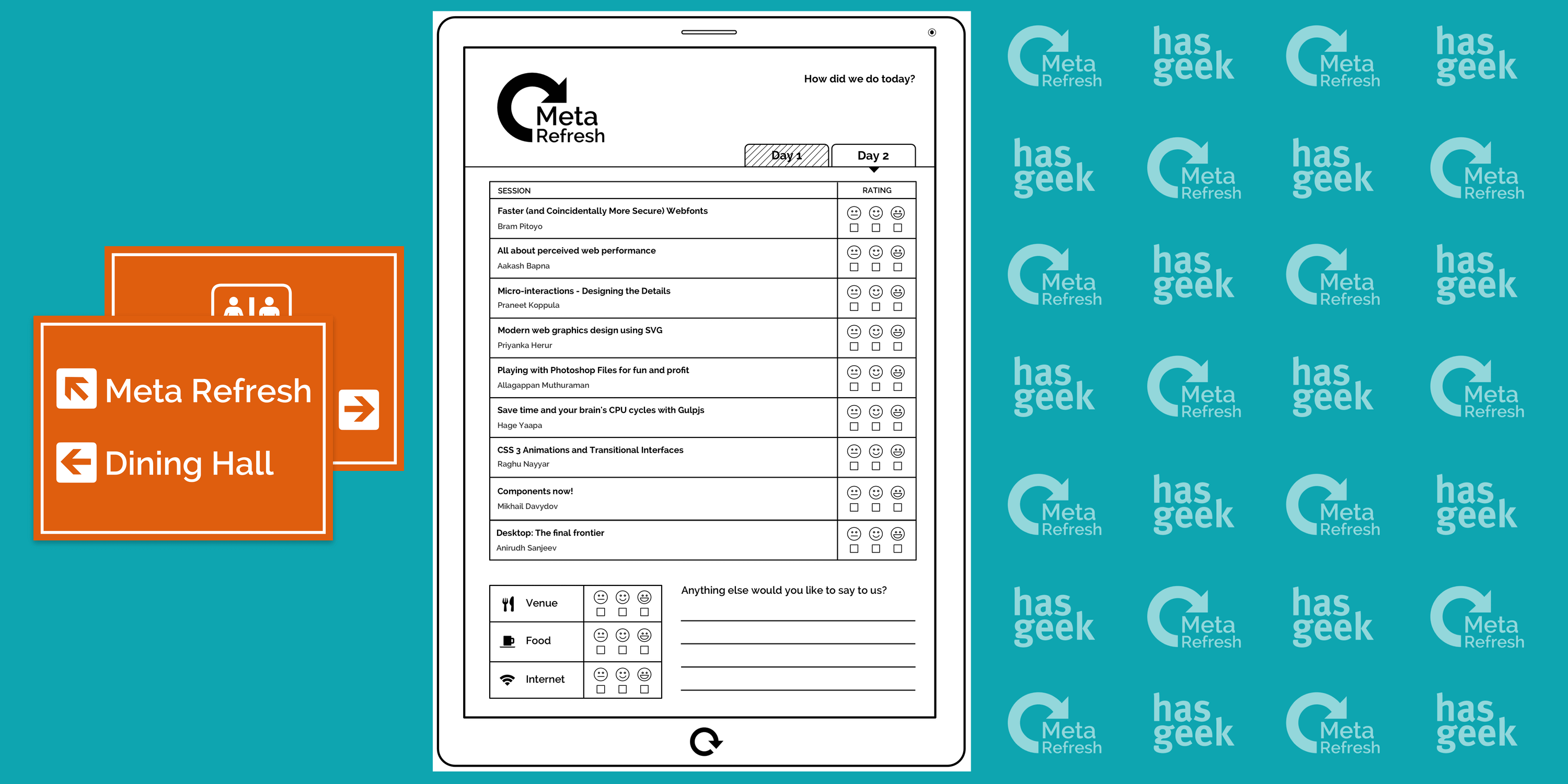
Extras
Signage & Feedback form